Yeah, I know, it's about time. I think I've mentioned that once or twice already. This project is a little more detailed than we had originally thought when we decided to begin this journey, but as I fine tune these first few pages the next ones should move faster. Decisions I make now for colors and images will continue throughout and I shouldn't have to constantly redesign the scenes. Having drawn the bedroom once, I know what's in the room for the next time.
As the writer Wayne has it easy, all he has to do is write down that the sheriff is in his early 30s and clean shaven but as the artist I need to make that look good on the page. I need to create a character that people can visually relate to and are hopefully going to want to follow. If he's badly drawn or looks too boring nobody's going to read any further than the first few pages, even if the story is fantastic (and it is, trust me). What kind of furniture is in the bedroom? What's the headboard look like? What color is the phone? All these little details can be skipped by the writer unless they're pertinent to the actual story, but for the artist all these details are needed to set the scene.
While I was going through all these little details it also occurred to me that the font size was a little large, so I reduced that on this page as well as going back to reduce the font size on the first page. With a reduced font size I also had to reduce the word balloons, which sounds easy peasy, right? Not so much. If I just reduce the balloons along with the text it changes the dynamics of the scene. Where the balloons are placed is equally as important as the text within them. They're still within the same area as I had originally set them but there have been subtle shifts to allow for more visual imagery. Each frame that is going to have text needs to be designed so that there's an area for that text to go without blocking anything in the scene, but you still need to draw in the scene behind where the text will go (just in case the writer gets a brilliant idea to change the dialogue or prose). It happens. Fortunately this time all the tweaks he made were later in the story and haven't affected the pencil work . . . so far.
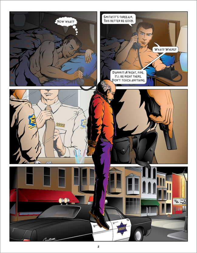
I really like the way this page has come together with the colors all blending throughout the page. The first frame opens in darkness and then there's a diagonal splash of light before going back into darkness in the last frame. I'm also happy with the lighting effects throughout, especially the last frame with the glow from the streetlamp, the headlights and the theatre signage. I'm not sure that the headlights are 100% accurate for how they overlap but it's -20°C outside at the moment and I'm not going to go out shooting reference images. I probably will at some point if it really bugs me, but overall I'm happy with the way it looks.
If we were really going for 100% accuracy I'd also have to check the font style used on theatre signs in this time period but seeing as how this is just a tiny little reference point I don't think I need to do that. If somebody out there happened to work in a theatre when that movie was first released feel free to let me know what font they used on the signs. While you're at it, check out those coming soon posters on the wall.
So there you have it. I have now completed the progress of page two and I'm moving on to page three which I will blog about soon enough. Probably some time next week or so depending on how quickly everything moves. I'm never sure how many people actually read through my blog posts as nobody ever seems to comment about them. It's entirely possible that I'm doing all of this more to maintain a record of the project than to update my numerous followers (the three of you know who you are), but I will continue to do so because I do know that people are following the story based on the page hits. I also get feedback via my Twitter and Facebook accounts. I appreciate all the constructive criticism and kudos and hope that everyone is enjoying the ride.
It's about time I figured out what's going on with our hanged man and who the heck he is. Keep an eye out for page three coming soon.
 RSS Feed
