Wow! It's been over a month since my last post here, . . . almost two in fact. During that time I've been busy with other blogging on my review site www.amazingracecanwithgordandwayne.weebly.com which is a joint blogging site that some of you may be familiar with. If not, no worries, but you should check it out when you have the time. On that site we review reality TV programs, most notably Amazing Race Canada, The Amazing Race (US), Survivor and other reality based entertainment.
Even our current project, the graphic novel that many of you are following during the development stages, has some basis in reality. The problems with illustrating reality are that you need to do your research. More to the point, I need to do my research. I can't have a 1986 Corvette driving around on the streets of 1970 small town America. It just isn't going to work. Somebody, sooner or later is going to notice the problem and call me on it . . . and I can't blame them. I'd do the same. It's that attention to detail that sometimes slows down the actual production. That and my ever increasing need to grow my client base and make enough money doing what I do from day to day in order to see this project through to its conclusion . . . mass publication and untold riches.
Another key attention to detail is that sometimes, when you draw out your initial sketches you don't add in all the detail you need and then when you are reworking the design you fail to notice certain flaws . . . like the fact that you've missed some knuckles. I'm sorry. I'm not proud of the fact that for some reason basic anatomy has fallen out of my brain. Especially difficult to come to terms with since I have two perfectly good reference points sitting in front of me right now. I mean, seriously, check out that gimpy left hand in the first frame. I've got all the phalanges the wrong length and I've even managed to miss a few when I roughed this up. What was I thinking?
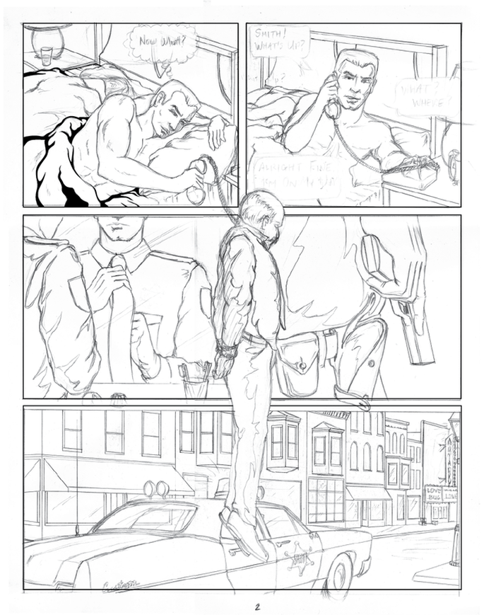
Okay, a lot of you probably never even noticed it but I did and since I'm the art guy it was driving me crazy. Obviously I wasn't going to just let it slide. It had to be fixed. I couldn't have the main protagonist have a gimpy left hand in frame one and then all of a sudden it's in perfect shape while he ties his tie in frame three. There's nothing wrong with having a character with a gimpy hand if your story requires it, or it's a defining character trait for that character, but in this case it's not.
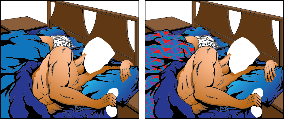
Since I had already inked and coloured that frame I didn't want to have to redraw the whole scene, that's the whole point of working on this digitally. So I copied the initial ink work for the hand and then blocked in the proper sections for the back of the hand and the phalanges. It's still a little flat but as you can see with the overlay at least now it looks right. The knuckles are where they're supposed to be and the thumb is properly attached. Add in a little shading and a few more details and "voila" we have a less gimpy left hand.
Since I had already inked and coloured that frame I didn't want to have to redraw the whole scene, that's the whole point of working on this digitally. So I copied the initial ink work for the hand and then blocked in the proper sections for the back of the hand and the phalanges. It's still a little flat but as you can see with the overlay at least now it looks right. The knuckles are where they're supposed to be and the thumb is properly attached. Add in a little shading and a few more details and "voila" we have a less gimpy left hand.

You still don't see the difference do you? Trust me, there's a difference. Take a look at the image below to see the frame before and after the correction and you'll get a better understanding of the things that illustrators need to pay attention to . . . always. Sometimes we get lazy. I've seen plenty of really bad art drawn by people who are paid a lot more than I am. I've also seen some really great art by people who aren't paid at all and just do it because they enjoy it. Frankly, I prefer to be paid . . . but I do enjoy what I do. Now do you see how much better that frame looks? Just wait until my next post when you can enjoy the finished frame.
 RSS Feed
